Analytics And Intelligent Systems

NUS ISS AIS Practice Group

Relationship between Household Electricity Consumption and Surface Air Temperature in Singapore — October 15, 2018

Relationship between Household Electricity Consumption and Surface Air Temperature in Singapore

1. Introduction

According to the National Environment Agency (NEA), Singapore’s household electricity consumption has increased by about 17 per cent over the past decade [1]. A 2017 NEA survey of 550 households found that air-conditioners were largely to blame, accounting for about 24 per cent of the consumption of a typical home [1]. However, it remains unknown if households currently use their air-conditioners out of habit (e.g. turning on the air-conditioner every day), or when the need arises. In addition, when referenced against the surface air temperature, there might be a delay in turning on the air-conditioner as our sensation of heat depends not only on temperature, but other factors such as humidity, cloud cover, sun intensity and wind [2]. Hence, the intent of this study is to investigate if there is a relationship between household electricity consumption and the surface air temperature in Singapore.

2. Hypothesis

This study hypothesises that:

  1. Household Electricity Consumption in Singapore is influenced by the Surface Air Temperature of Singapore
  2. There are no appreciable lags between the two variables

3. Data Sources

Table 1: Data Sources

Variable Frequency Source URL
Mean Surface Air Temperature Monthly National Environment Authority https://data.gov.sg/dataset/surface-air-temperature-monthly-mean
Household Electricity Consumption Monthly Energy Market Authority https://data.gov.sg/dataset/monthly-electricity-consumption-by-sector-total

To perform analysis on these variables, data sources with the same time resolution was first obtained from data.gov.sg. The Mean Surface Air Temperature was obtained from the “Surface Air Temperature – Monthly Mean” dataset published by NEA, whereas the Household Electricity Consumption was obtained from the “Monthly Electricity Consumption by Sector” dataset published by the Energy Market Authority (EMA) of Singapore.

It was noted that “Monthly Household Electricity Consumption” records are only available till September 2015. Hence, this study utilised data from October 2010 to September 2015 (5 years), providing a total of 60 data points for analysis.

4. Analysis of Input Series

4.1 Pre-whitening of Input Series

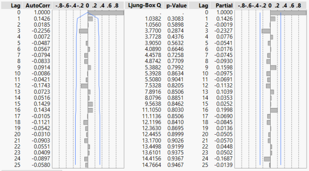
Based on our hypothesis indicated in section 2, the input series was taken to be Mean Surface Air Temperature. Initial inspection of the data reveals that the data was stationary. However, based on the time series and the Autocorrelation Function (ACF) plots, a 12-month seasonality was observed. This is consistent with the knowledge that weather in Singapore follows a 12-months cycle, largely characterised by two monsoon seasons – the Northeast Monsoon (December to early March) and the Southwest Monsoon (June to September) [3]. As such, the first step is to apply a first order seasonal differencing of 12 months to the input series.

Figure 1
Figure 1: Basis for first order seasonal differencing, season = 12 months
Figure 2
Figure 2: ACF and PACF plots after first order seasonal differencing, season = 12 months

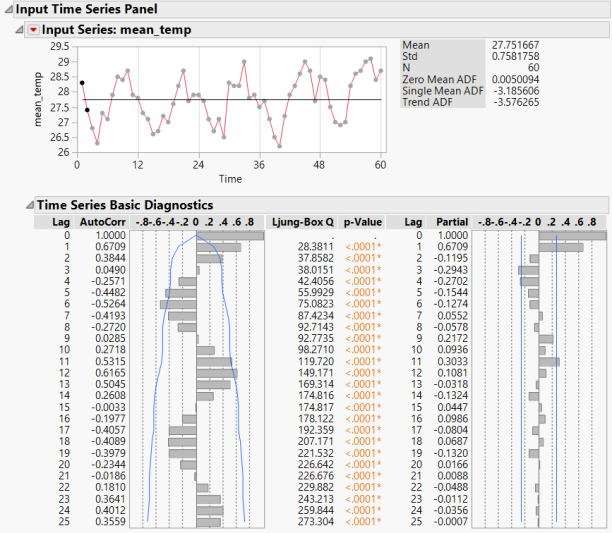
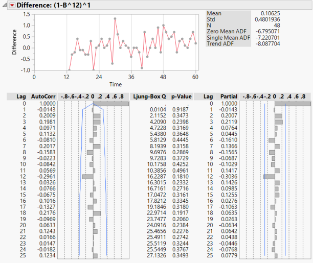
The resulting Autocorrelation Function (ACF) and Partial Autocorrelation Function (PACF) plots (Figure 2) indicated that the resulting residuals are white noise. Hence, the Seasonal Difference model built for the input series is taken to be (0,0,0),(0,1,0)12 at this stage.

5. Analysis of Output Series

5.1 Pre-whitening of Output Series

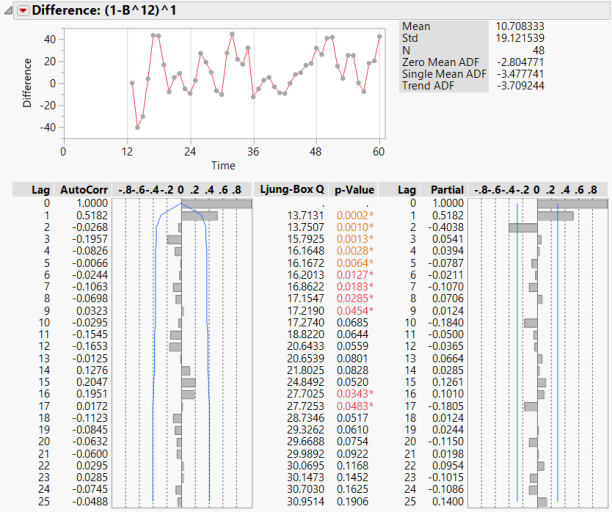
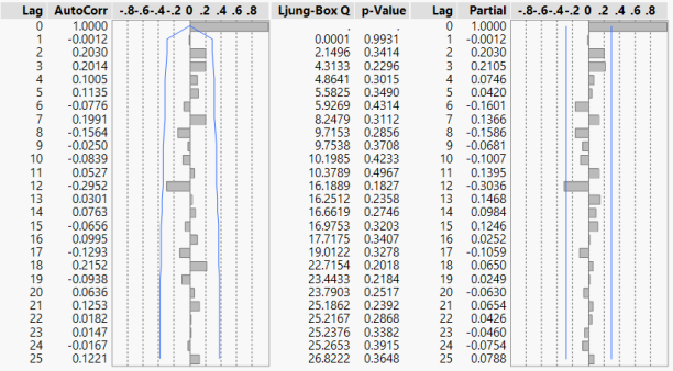
With the Seasonal Difference Model for the input series identified in section 4.1, the output series (Household Electricity Consumption) was pre-whitened with the same model. Based on the ACF and PACF plots in Figure 3, it’s observed that the PACF plot is dying down, while the ACF plot cuts off at the first lag. As such, a MA(1) term was added to the Seasonal Difference model in an attempt to achieve white noise residuals.

Figure 3
Figure 3: (0,0,0),(0,1,0)12 I model applied on output series

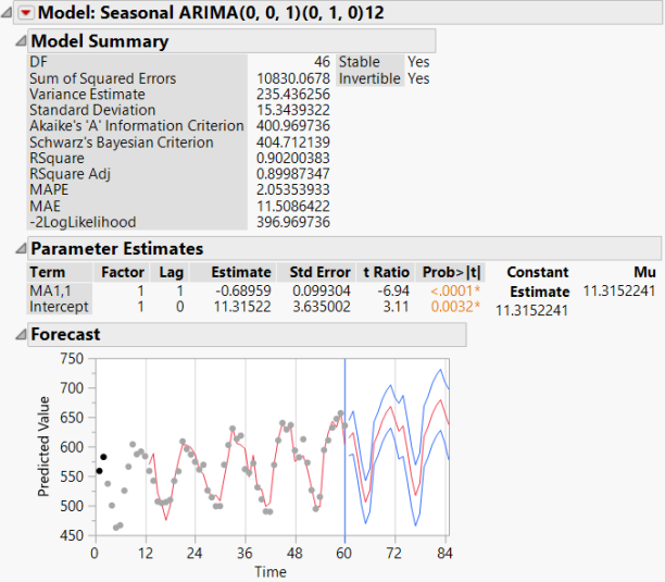
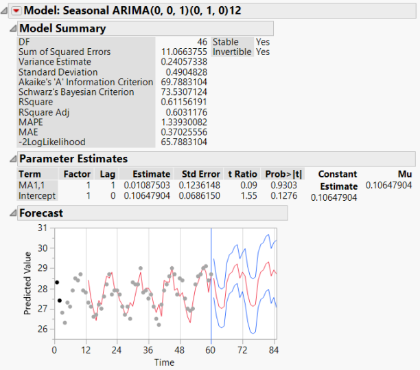
From Figure 4, it was observed that the MA(1) term added was significant. The Akaike’s ‘A’ Information Criterion (AIC) was deemed acceptable, and the model managed to accurately model the 60 points to project a forecast that not only repeats the trend, but also has a tight confidence interval. The residuals of this (0,0,1),(0,1,0)12 IMA Model has also achieved white noise as evidenced in the ACF and PACF plots in Figure 5. Hence, the IMA model built for the output series is taken to be (0,0,1),(0,1,0)12 at this stage.

Figure 4
Figure 4: (0,0,1),(0,1,0)12 IMA Model (Output Series)
Figure 5
Figure 5: ACF & PACF Plots for (0,0,1),(0,1,0)12 IMA Model (Output Series)

5.2 Verification of white noise residuals on Input Series

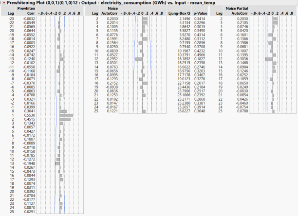
Since the input series was previously pre-whitened with a (0,0,0),(0,1,0)12 Seasonal Difference model, the IMA model (0,0,1),(0,1,0)12 developed for the output series was applied to the input series to verify that pre-whitening the input series with the output IMA model would still result in white noise residuals.

Based on Figure 6, it was observed that the residuals remained as white noise. In addition, it was observed that the additional MA(1) term added is not significant. This was assessed to be reasonable, as the original input series didn’t require this MA(1) term during the previous pre-whitening stage to achieve white noise. Hence, the final model chosen is a (0,0,1),(0,1,0)12 IMA Model.

Figure 6
Figure 6: ACF & PACF Plots for (0,0,1),(0,1,0)12 IMA Model (Input Series)
Figure 7
Figure 7: (0,0,1),(0,1,0)12 IMA Model (Input Series)

6. Transfer Function Modelling

6.1 Cross-correlation between Pre-Whitened Series

With the (0,0,1),(0,1,0)12 IMA model finalised in section 5.2, the cross correlation between the pre-whitened input and output series was computed. From the results shown in Figure 8, significant correlation was observed between lag 0 to 2. Hence, the transfer function model will resemble the following equation:

eqn 6.1

where are the transfer function weights to be determined.

Figure 8
Figure 8: Pre-whitening Plot (0,0,1),(0,1,0)12

6.2 Transfer Function Model Parameters

An alternate method to represent the model would be as follows:

eqn 6.2.1

where

eqn 6.2.2

In order to determine the transfer function model, the parameters b, s and r must first be identified. From Figure 8, it was shown that the first non-zero correlation starts at lag 0, which means that the input and output series are in sync. As such, b = 0. Meanwhile, the cross correlation peak was observed at lag 1. Hence, s = 1. Lastly, it was noted that the cross correlation seemed to be oscillating about 0 in the pre-whitening plot. Hence, r = 2 was selected.

6.3 Transfer Function Model Evaluation

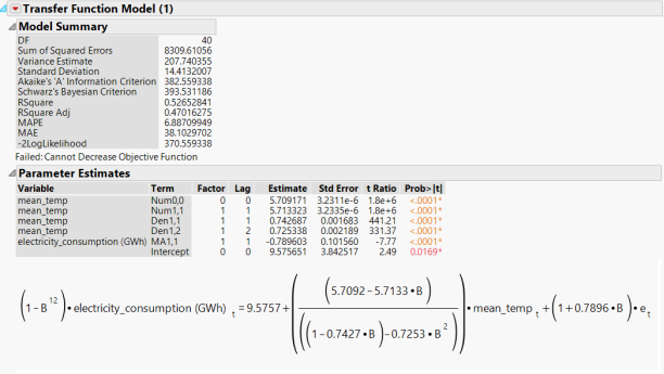
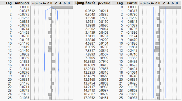
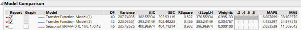
With the transfer function model parameters selected in the previous section, the model was fitted and evaluated. From Figure 9, it was observed that both the AIC and Schwarz’s Bayesian Criterion (SBC) are reasonably small, and the parameters used in fitting the models were all statistically significant. Figure 10 also shows that the residuals of this transfer function model was white noise. Compared with an alternate transfer function model where r = 1 (b = 0, s = 1, r = 1), this model was assessed to be better in terms of AIC and SBC. Hence, the final transfer function model parameters selected was (b = 0, s = 1, r = 2).

Figure 9
Figure 9: Transfer Function Model Summary (b = 0, s = 1, r = 2)
Figure 10
Figure 10: ACF & PACF Plot of Transfer Function Model (b = 0, s = 1, r = 2)
Figure 11
Figure 11: Comparison between Transfer Function Models (b = 0, s = 1, r = 2) and (b = 0, s = 1, r = 1)

7. Relationship between Household Electricity Consumption and Mean Surface Air Temperature

Based on the pre-whitening plot in Figure 8, it was initially concluded that there was no lag between Household Electricity Consumption (y) and Mean Surface Air Temperature (x). However, expansion of the transfer function model shown in figure 9 yields the following relationship:

eqn 7.1

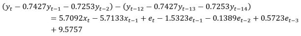
This shows that while there is no lag between x and y, past values of both variables also impact y. More importantly, it was observed that the coefficients of each y term are the same with itself 12 months ago. Rearranging the above formula gives the following:

eqn 7.2

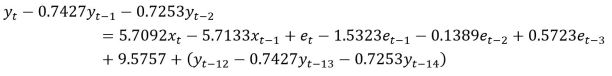
This means that while yt-1, yt-2, xt, xt-1, et, et-1, et-2 and  et-3 may explain the variability in y, an offset from last year’s set of y terms is required for it to fully explain yt. This indicates an upward trend in household electricity consumption, assuming mean surface air temperature remains the same every season.

8. Conclusion

This study hypothesizes that there is an instantaneous unidirectional relationship between the mean monthly surface air temperature of Singapore, and the monthly household electricity consumption in Singapore. While some believe that human behaviour such as being cost conscious or simply the lack of awareness of rising temperatures may influence and possibly delay the decision to switch on the air-conditioner, time series transfer function modelling of these two variables confirms that (1) household electricity consumption is influenced by mean surface air temperature and (2) they are moving in phase.  It was further observed that there is a rising trend in the household electricity consumption in Singapore, as household electricity consumption is autocorrelated with its previous season.

9. References

[1]      A. Zhaki, “Singapore’s household electricity consumption up 17 per cent over past decade,” The Straits Times, Singapore, 05-May-2018.

[2]      AccuWeather, “The AccuWeather RealFeel Temperature,” 2011. [Online]. Available: https://www.accuweather.com/en/outdoor-articles/outdoor-living/the-accuweather-realfeel-tempe/55627. [Accessed: 18-Sep-2018].

[3]      Meteorological Service Singapore, “Climate of Singapore.” [Online]. Available: http://www.weather.gov.sg/climate-climate-of-singapore/. [Accessed: 18-Sep-2018].

Team Name Zero
Student ID Name
A0178551X Choo Ming Hui Raymond
A0178431A Huang Qingyi
A0178415Y Jiang Zhiyuan
A0178365R Wang Jingli
A0178329R Wong Yeng Fai, Edric
A0178371X Yang Shuting
A Survey on Singaporean Traffic and Roadwork Data — August 7, 2017

A Survey on Singaporean Traffic and Roadwork Data

Introduction:

When you’re driving around in the Business Hub of the world, you would obviously expect things to be a bit on the congested side. As of the Tom Tom world traffic index in 2016, it has been observed that singapore has witnessed a rise in congestion levels due to traffic. This comes as no good news, as the existing traffic condition in the country adds about 34 minutes of extra travel time on an average. Combine that with the pre-existing traffic situation in Singapore and you’re staring at a big logistical problem.

However, many efforts are being taken on the travel optimization front in the city. The introduction of the Electronic Road Pricing or ERP systems that reduced the time wasted on manual parking fee collections. Further efforts to reduce traffic congestion and improve quality of transport across the country need sufficient backing by meaningful data and statistics. This is the inspiration behind surveying the country’s traffic and incident data.

Data Acquisition and Pre-Processing:

Data for the survey was pulled from Data.gov.sg as well as the Land Transport Authority Data Mall. We extracted the following fields from the available APIs for the use of our survey models.

Label Description
Incident Type Road incident type. Example: Roadwork, Accident, Vehicle Breakdown.
Geographical Location Geographical data consisting of Latitude and Longitude.
Road Name Name of the road where the incident has occurred
Time Time details about the incident, consisting of start and end time of the same.
Temperature Average Temperature recorded in singapore for the corresponding time stamp.
Pressure Pressure recorded in Singapore for the corresponding timestamp.
Humidity Average Humidity recorded in Singapore for the corresponding timestamp.

Data Sources: https://data.gov.sg/dataset/public-transport-utilisation-average-public-transport-ridership ; https://www.mytransport.sg/content/mytransport/home/dataMall.html ; www.nea.gov.sg

GQM Analysis:

Goal:

The broad goals of this analysis is to devise methods that will aid in a reduction of congestion due to traffic while simultaneously reducing the effect of roadway incidents on the traffic.

Questions:

To provide solutions that help us achieve our goals, we have to answer some basic questions first. Here are the main questions whose answers we feel are imperative in order to achieve solutions leading to our goals. We have grouped them into the 4 main types of questions we need.

  • Where?

Where is traffic concentrated across the city?

To understand how we must tackle the problem of overcrowding the roads, we must first understand what the most affected areas are.

  • When?

When is the Traffic at its peak?

To develop a sustainable planning model, we will also require the times at which traffic it at its peak. For example, if one were to schedule a roadwork activity, they would have to make sure it doesn’t clash with peak traffic timings so as to minimize its effect on the congestion.

When do majority of incidents occur?

By understanding the distribution of incidents across times, we would be able to estimate and predict the likelihood of its occurrence and correspondingly take action.

  • How?

How is the distribution of major roadwork incidents across the country?

To allocate resources for different tasks, we must know the different kinds of incidents occurring across the country, along with their individual frequencies of the same.

  • What?

What are some factors that affect traffic conditions?

Do factors such as weather influence the traffic incidents in Singapore? If so, is it possible to predict the likelihood of certain incidents based on weather? And if there weather affects the traffic conditions by a lot, we could focus planning activities on mitigating the effects of the same.

Metrics:

  1. Geospatial Traffic Data- Incident Flag, Latitude, Longitude.
  2. Time Data- Start Time, End Time, Total Time.
  3. Weather Data- Temperature, Humidity, Pressure.
  4. Incident Frequency Rate.

Data Dashboard:

     Click on the picture to view the Public Tableau Dashboard


Insights and Conclusions:

  • We observe that most incidents take place during the day and that there are very few recorded cases of traffic related incidents during the night.
  • Roadwork incidents seem to take the longest amount of time, and hence must be planned carefully so as to not disrupt normal traffic.
  • The effect of Temperature, Humidity and Pressure upon Singapore traffic is minimal, and that traffic is weather-independent.
  • A majority of the traffic related incidents seem to occur around the Central Business District in Singapore, thus indicating where most resources must be pumped.
  • A more in-depth analysis can be done over a longer period of time and can yield better insights


Team of 
Naitik Shukla (A0163426H)
Navneet Goswami (A0163221W)
Shobhit Jaipurkar (A0163331R)
Vignesh Srinivasan (A0163246H)
Performance Management Dashboard for the Early Childhood Development Agency — August 6, 2017

Performance Management Dashboard for the Early Childhood Development Agency

Analysis of Demand for Regional Child Care Centers

The emergence of new Built-To-Order Housing and Development Board (HDB) flats often drives demographic changes within each town – new towns are characterized by a strong presence of young adults while older towns tend to face issues surrounding ageing population. As such, there is a need for interested government bodies, such as the Early Childhood Development Agency (ECDA), to understand the population structure as well as the quality and sufficiency of child care facilities within each town in order to better allocate manpower and logistic resources to meet the evolving needs and promote pro-family services that may in turn alleviate the nation’s falling birth rate.

Performance Management Dashboard for the Early Childhood Development Agency

The Early Childhood Development Agency (ECDA) is the regulatory and developmental authority for early childhood services in Singapore. Its mission is “to ensure every child has access to affordable and quality early childhood development services and programmes.” Putting ourselves in the shoes of ECDA’s planning division director, we envisage this role to be responsible for charting various organisational strategies to achieve the goals of accessibility, affordability and quality so as to fulfill the agency’s mission. To assist the director in assessing whether the organisation is on track to achieve the goals set out for the fiscal year, we developed a performance management dashboard highlighting several useful key performance indices (KPIs).

Business Goal:

To create for the planning division director of ECDA a dynamic dashboard for tracking KPIs and answering the following business questions:

Accessibility and Sufficiency of Childcare Facilities: Enrolment Rate

1. Is the average child care centre enrolment rate in each town optimal? Are there areas where new centres are required?

Measurable KPI: Difference between the desired level of enrolment rate and the observed enrollment rate in the last four quarters.

Both under-enrolment and over-capacity are suboptimal. Optimal enrolment is required to ensure that centres are able to reap economies of scale and cover operating costs, without compromising the accessibility and sufficiency of childcare facilities.

Findings: Towns such as Bukit Timah, Bukit Batok, Choa Chu Kang, Tampines, Kallang, Sengkang and Punggol are currently in the Red Zone. While some of the districts such as Bukit Batok, Bukit Timah and Kallang have under-enrolment issues, the rest of the towns are at risk of having under-capacity issues (e.g newer towns such as Punggol, Sengkang, Choa Chu Kang, as well as Tampines).

Among the under-capacity towns, the newer estates have more future demand for child care centres compared to the older towns. This is suggested by the difference between the current number of dwelling units and the projected ultimate. For instance, Punggol is estimated to expect a doubling of housing units in the next few years. In such areas where an influx of population and a potential hike in absolute number of children born are expected, ECDA should aggressively increase the number of child care centres in order to meet the growing demand for such services in years to come.

On the other hand, older towns such as Bukit Timah has almost reached it’s maximum housing and population capacity, with less than 8% of dwelling units to be expected in the future. Furthermore, it also has under-enrolment issues. Given this backdrop, the growth of child care centres in these estates needs to be moderated. While it is not possible to force childcare centres to close, it is perhaps ideal to let market forces take over.

Capture1


Capture2


Capture3

2. Will the current plan of building child care facilities in areas of risk succeed in reducing the number of towns whose enrolment rate falls outside the optimal zone?

Measurable KPI: The number of towns that has an enrolment rate falling outside the optimal zone.

To address this question, we project the absolute enrolment figures into 2017 Q3 and Q4, and considering the additional capacity that would be added due to new centres being built in these two quarters, we derive the projected enrolment rate. By comparing the projected enrolment rate and the target overall FY17 level, we will be able to assess if the planning division is on track to meet the KPI. For this KPI, the target is not strictly 0. Since it takes a long-term view to see improvements in optimal enrolment rates, a more attainable and time-bound target would be to aim for at least an incremental improvement.

Findings: While the appropriate intervention strategies in the younger town could move places such as Sengkang and Punggol out of the red zone, there will be towns such as Marine Parade joining the list. Yet, for the case of Marine Parade, as the remaining housing unit capacity of 8% suggests that there may not be much room for new HDB estates to be built, growth in these estate needs to be moderated.

MP

Affordability: Fees and Charges

3. Will an average family in Singapore be able to afford child care services?

Measurable KPI: The overall median monthly fees for full-day child care services

It is important to assess the growth of child care industry median fees. Assuming an annual inflation rate of 3%, a hike in child care prices beyond this level can potentially reduce child care affordability. Ensuring a reasonable growth of average child care fees in each town is a critical part of pro-family policies.

Findings: The KPI target is set to be 3% above FY16’s median fees. In this respect, performance for this KPI is expected to be very well within the FY17 target. This could be due to the growth of partnership programmes, as discussed in the following question.

4. How will the growth of partnership programmes such as the Anchor Operator (AOP) and Partner Operator (POP) schemes help anchor the growth of industry median fees?

Measurable KPI: Proportion of child care centre capacity contributed by centres under the AOP and POP schemes as a ratio to the proportion of Singaporeans living in HDB.

This KPI is significant as one of the main goals of the AOP and POP schemes is to help anchor the growth of industry median fees. These operators, which are government-appointed and receive government grants, are child care centre service providers which have to cap fees, at $720 and $800 a month respectively for full-day childcare, among other criteria. The growth of operators under these schemes will help anchor the increase in childcare industry median fees. The KPI is measured as a ratio to the proportion of Singaporeans living in HDB in order to factor in regional characteristics (for e.g. Bukit Timah has a higher percentage of private home owners, hence the preference may be for private childcare services instead of childcare operators under the AOP/POP schemes.)

Findings: Comparing the change in median fees and the change in AOP & POP Ratio Over Time, we see an interesting but not unexpected correlation. As the ratio dipped in 2016 Q4, we may observe a corresponding increase in median fees. As the ratio increased gradually over the next few quarters, we see a corresponding trend of decrease in median fees. This suggests that the growth of AOP and POP schemes does have impact on median fees that can be explored further.

2

However, an anomaly is observed at Bukit Merah:

Capture4

Quality: Partnership Programmes

5. How can ECDA achieve a balance between anchoring the growth of industry median fees and not compromising the quality of childcare services?

Measurable KPI: Proportion of child care centre capacity contributed by centres under the AOP and POP schemes as a ratio to the proportion of Singaporeans living in HDB.

The same AOP/POP scheme ratio KPI can be used as an indicator of the quality of overall delivery of childcare services in Singapore. Both AOP and POP schemes, besides having stringent fee caps, also ensures good quality developmental programmes by subsidizing the professional development of centre leaders, teachers and caregivers. The greater number of operators achieving eligibility for these schemes will not only help anchor the growth of fees, but also ensure good quality childcare services.

Findings: There is an overall gradual growth in AOP/POP scheme ratio. Most of the towns have relatively high ratios, with the exception of Bukit Merah, Clementi and Geylang. The low ratio shows that these are the estates which require specific attention. More can be done to introduce AOP/POP scheme child care centres to these towns.

While most estates experience a rise in AOP/POP ratio in the past year, Tampines registered a falling ratio instead. This may indicate a sudden influx of non-AOP/POP operators. There is no guarantee that these operators will meet the necessary quality standards. That being said, the AOP/POP ratio is still within the acceptable range. Hence, ECDA’s attention can be diverted to other areas of need.

Capture5


Summary of KPIs

Category KPI FY17 Target Derivation
Accessibility and Sufficiency Overall Enrolment Rate Green Zone: 75 +/- 2.5%
Risk Zone: 75 +/- 5%
Red Zone: < 70% or > 80%An enrolment rate of around 75% is assumed to be most optimal as most of the child care center resources are utilized at this rate, but there remains reasonable bandwidth for unanticipated surge in needs.
Number of Towns Outside Zone Green Zone: < 6
Risk Zone: 6 (No improvement)
Red Zone: > 6Based on 2016 Q4 KPI snapshot value of 6.
Affordability Median Monthly Full-Day CC Fees Green Zone: < $917 (< 3% increment)
Risk Zone: $917 – $935 ( < 5% increment)
Red Zone: > $935 (> 5% increment)Inflation rate in Singapore averaged 2.64% in the past decades. Hence, an increment of approximately less than 3% will be ideal.
Affordability and Quality Proportion of AOP/POP CCCs (By Capacity) Green Zone: > 0.62
Risk Zone: 0.6 – 0.62
Red Zone: < 0.6

Dashboard Design and Assumptions

31.pngLink to Dashboard

As the dashboard is designed for the planning director of ECDA in mind, here are the important considerations:

  1. The most relevant KPIs are placed at the top left hand corner for readability, along with each KPI’s target.
  2. Blue and orange are used as informative colours
  3. Other charts illuminate the KPI trends by introducing the time component along with a projection of the fiscal year end results.
  4. The map serves as a filter to drill down to the town level. Besides, it also shows the median fees colour-coding each town polygon for greater appreciation of the regional characteristics. The map also displays the location of new child care centres.
  5. Axis breaks have not been used due to large differences in values across towns.

List of Assumptions and Disclaimers

  • Due to data availability, the current quarter is assumed to be 2017Q2.
  • Due to lack of ECDA official enrollment, capacity and centre information for 2015 and 2016, 2016Q3 statistics are simulated.
  • Assuming new child care centres, its license type (AOP/POP/NONE), its capacity as well as the potential number of children born to a particular town are jointly predicted by HDB and ECDA. Mock up enrollment statistics (predicted) are used to represent this piece of information for 2017Q3 and 2017Q4.
  • Median fees for 2017Q3 and 2017Q4 are projected using an inflation rate of 5%.
  • All choice of KPI are stipulated using existing data to reflect a reasonable and realistic simulation.

Data Sources:

  • Enrollment, capacity and centre information

https://www.childcarelink.gov.sg/ccls/uploads/Statistics_on_child_care(STENT).pdf
https://www.ecda.gov.sg/Documents/Statistics_on_child_care(STENT).pdf
https://www.msf.gov.sg/policies/Strong-and-Stable-Families/Nurturing-and-Protecting-the-Young/Child-and-Student-Care-Centres-and-Services/Documents/Statistics_on_child_careSTENT.pdf

  • HDB Housing Information

http://www.hdb.gov.sg/cs/infoweb/about-us/news-and-publications/annual-reports

Annual reports from 2010 to 2016 are scrapped for data

  • Population Data

http://www.singstat.gov.sg/statistics/browse-by-theme/geographic-distribution

Utilized Data:

Singapore Resident by Planning Area/Subzone and Type of Dwelling, June 2000-2016
Singapore Resident by Planning Area/Subzone, Age Group and Sex, June 2000-2016

Team Members:

Liao Jiexun Jacob (A0163410W)
Luo Jiayu Joy (A0065569N)
Xu Hao Chang (A0163416J)
Zhu Wei (A0163199U)

Insights into Singapore Tourism Industry —

Insights into Singapore Tourism Industry

Motivation

Tourism sector has been one of the major industry and contributor to Singapore economy. According to Singapore Tourism Board (STB), 2016 hit a record of 16.4 million international tourists and generated $24.8 billion. The government has allocated $905 million to STB to fuel up the tourism developments by investing it with manpower competency and conference management. 

Over the years from 2013 to 2015, the top 5 countries with the most visitors to Singapore are: Indonesia, China, Malaysia, Australia, India. Among them, only Australia belongs to the top 5 affluent countries (countries with highest GDP per capita: Switzerland, Australia, USA, Netherlands, UK).  

GQM analysis

Goal

To fully maximize revenue from underdeveloped markets through insights from existing tourist behavioral patterns towards retail and local attractions. 

Questions

  1. What is the visiting trend over the recent years for countries of interest? 
  2. What are the types of products to promote to each country? 
  3. What are the types of attractions to promote to each country? 
  4. What is the target market to be improved? 
  5. What might be behind the trend of visitors from these countries? 
  6. What are the top products being bought by visitors?  
  7. What are the top visited attractions? 
  8. How to influence visitors from target market to spend more? 
  9. How to increase visitors to the local attractions? 

Metrics

  1. Top 5 countries with the most visitors. 
  2. Top 5 countries with the highest GDP per capita. 
  3. Trend of visitors from each country over recent years. 
  4. Top 3 retail spending for each country. 
  5. Top 3 paid attractions for each country. 
  6. Top 3 free attractions for each country. 

Dashboard Analytics

Insights into Top Visiting Countries

1.Insights into Top Visiting Countries

Insights into Top Affluent Countries

2.Insights into Top Affluent Countries.jpg

Analysis summary

In 2015, the top visiting countries account for 8 million visitors while the top affluent countries account for only a total of 1 million visitors, an eighth of prior. Hence, there are definitely areas within the local tourism industry that can be optimized and improved.

Background on world economy

3.Background on world economy

Since 2010 until now, World Bank’s data reveals that there are 3 predominant countries with consistently growing GDP per capita and population, USA, India and China. With USA being the fastest in income growth, India being the fastest in population growth and China in between. USA being the most affluent amongst them and China being the most populated.

Trend of visitors

Indonesia and Malaysia travelers in the list of top countries with most visitors was not a surprise due to the proximity, ease of travel and some families ties in Singapore. Most of them are repeating visitors who are already familiar with Singapore offerings. STB managed to lure them back by making them engaged on what are the latest and new happenings in Singapore with the “Your Singapore Live” campaign and providing easy access from package bookings, flight and event information. Although there was a 10% decline in 2015, last year (2016)’s figure for Indonesians had increased 6% [7]. STB is putting more effort to make sure Indonesia remains our number one market.

The total number of Chinese visitors has declined significantly to 1.7 million in 2014 due to the Malaysian Airlines aviation disasters happened in the same year, because a large number of Chinese tourists visit the city as part of a package that includes Malaysia and other countries in Southeast Asia. The number slowly recovered to 2.1 million over 2015, then increased to 2.86 million tourists in 2016, as the travelers finally put the disaster memory behind.

Different from the declination of visitors from other countries, the 2014 and 2015’s figures for Indian visitors had increased. According to Euromonitor, Singapore is expected to register a 59% jump in arrivals from India from 2015 to 2020. The number of arrivals from India increased 15% in the first five months of 2017. This is mostly due to the increasing trend of cruise traveling among Indians [10].

Among the top affluent countries and the countries with top visitors to Singapore, however, the figure for total Australian visitors is decreasing, though slowly, since 2014 till 2016. In 2017, STB and Singapore Airlines are promoting Singapore as “the stopover holiday”, as Singapore Changi airport is usually the Australian tourists’ layover en-route hub to other destinations.

The trend of visitors from other affluent countries: the number of tourists from UK and USA though not among the top, but is still increasing. Meanwhile, the number of tourists from Switzerland and Netherlands slowly dropped from 2014 to 2015, but recovered again in 2016, given the small population of these two rich countries, the increment is significant.

STB has been successful in the marketing campaign on the target audiences. All the top 5 countries with most visitors are in its key target market list. Each of these countries have been uniquely advertised according to how these countries perceived Singapore.

Since 2014, Singapore has remained as the most expensive city in the world [8], hence one of the strategies is to boost up Singapore tourism is to focus on the most affluent countries as they can be the top spending tourists despite smaller in quantities; while still maintain the high flows of tourists from the two largest populations – China and India – as well as our neighbors, Indonesia and Malaysia, who are still at the top as countries with most visitors to Singapore. In order to do so, our team has tried to dig deeper into the habit of tourists from these countries: how these international tourists spent money in Singapore, and what their most visited attractions are. From these figures and graphs, we tried to come up with more insightful results about our goal.

Top retail spending

The top 3 segments being: Fashion, Beauty & Healthcare, Gifts.

Fashion and accessories have been the top items being bought in Singapore. This is not a surprise because a lot of international designers and shops have established in Singapore. They have seen Singapore as a strategic regional hub especially trying to reach out to Asian markets. Same goes for beauty cosmetic, perfume and healthcare category that is second in the list.

4.Top retail spending

For economy of scale and to align the overall strategic focus on the top 3 retail segments. USA is identified as a potential candidate to further boost the tourism industry. Being one of the most affluent and populated countries, it is amongst the lowest in top retail spending, there is potential for synergistically growing the top retail segments that tailor to this group of visitors which could also help bolster the overall USA visitors.

The trend of spending the most in fashion, beauty products and healthcare categories is not limited to visitors from the top 5 countries with most visitors, but also is the spending trend among tourists from the affluent countries. As Singapore remains the shopper paradise in Asia and the region’s leading capital in total visitor expenditure, to target visitors from the aforementioned affluent countries, we might pay our focus more on how to make the fashion trends and service quality in Singapore more adaptive to the USA and these European countries’ preferences and cultures.

Although not being mentioned in the chart, but food and beverages are also among the most spending target, especially for tourists from USA. The total spending in this category was up by 24% from 2015 to 2016 [2]. With Singapore’s rich and various cuisines range from East to West, low to high cost, street food to luxury restaurants, we should consider a long campaign about Singapore food diversity to these new markets.

Top paid attractions

5.Top paid attractions

There are two main categories of attractions which are entertainment and nature related. In entertainment, there are Integrated resort, Gardens by the bay, Sentosa and Singapore Flyer. In nature related, there are Night Safari, Singapore Zoo, National Orchid Gardens, Jurong Bird Park and River Safari. The top three paid attractions are in entertainments, maybe due to accessibility for the tourist and the unique experience they provide to the tourist. All nature related attractions are quite far and maybe inaccessible for tourist especially if they have tight schedule. STB could study how they can improve the visiting rates for these natures related paid attractions.

The top paid attraction is on integrated resort, this is consistent with the figure of 2016, as 24% of total receipts are for accommodation, up by 28% compared to 2015 [2]. This could be a result as Singapore usually the layover hub for most of flights from and to Australia, China, and Southeast Asia countries. Besides the variety of luxury hotels and resorts of all the most famous names in the world, one of the type of accommodation that we might invest more in to lure more Western traveler is the traditional and cozy homestay.

Without the bless of rich beautiful nature scenes as of other big countries, however, we have been very successful in promoting Gardens by the bay as most unique sight in Singapore. The sight was rated as the number one in things to do in Singapore on TripAdvisor. Although with a similar natural theme and diverse concepts, but the total visitors to River Safari, Zoo, Orchid Gardens, Jurong Bird Park, Night Safari are much fewer than the figure for Gardens by the bay. Instead of building more gardens like Gardens by the bay, we should invest more on these existing sites with the more unique themes, always-changing scenes, a wider marketing campaigns, and maybe an easier route from the city’s center.

Top free attractions

6.Top free attractions

In line with Fashion being the most popular retail segment in Singapore, Orchard road – Asia’s most famous shopping streets, home to fashion favorites, specialist stores and loads of other lifestyle choices – is the most visited site among the free attractions.

As more and more visitors from China and India, the other most visited free attractions of these tourists are Chinatown and Little India. Indonesian and Malaysian travelers definitely share the same trend, although they prefer Orchard road over these two destinations.

Regarding visitors from the affluent countries, the percentages among these three top attractions are quite balance, with Chinatown’s figure is slightly more preferable.

Conclusion and Further Discussion

2015 has seen the declining of numbers of visitors from most of the countries we have analyzed on. However, these figures have been recovered in 2016, and are continuing to increase this year as STB has successfully organized wide and various campaigns in the five countries with top visitors: Indonesia, China, Australia, India, Malaysia.

Beside the quantity of visitors, we are to expect to hit a new record on total spending by tourists this year. Among the most buying product categories are fashion, beauty products, accommodation.

Align with the spending trend, the most paid attractions in Singapore are, in descending order, integrated resorts, Garden by the bay, Sentosa; the most visited among free sites are Orchard road, Chinatown and Little India.

With the overview on Singapore tourism industry, in this report we focused on strategy to attract more tourists from the top affluent countries: Australia, Switzerland, Netherland, UK and the USA, as with the wealthy condition, they can be the top spending tourists despite smaller in quantities compared to others.

In regard to buying trend, we suggested to focus more on how to make the fashion trends and service quality in Singapore to be more adaptive to the USA and these European countries’ preferences and cultures. We also suggest to consider a campaign about Singapore food diversity to these new markets, for example USA, as Americans tend to spend more on food and beverages in Singapore.

As tourists are spending more on accommodation, we can invest more on our local hotels quality and quantity, but also should not overlook homestay with traditional styles, which can be much more attractive to the Western travelers.

One of the uniqueness of Singapore is our multi-cultures, multi-languages, food diversity. Travelers from Western countries can experience many rich Southeast Asia cultures: Chinese, Indian, Malaysian … in a small city. This can be another winning point for Singapore to get more and more tourists from the affluent countries from far West.

Last but not least, our report although walked through an overview of the picture of Singapore Tourism industry, with the focus on improving revenue on the new market – the affluent countries – we limited ourselves with the analysis on trending of number of visitors, buying products, paid and free attractions; there are still plenty of other aspects to be analyzed to make the strategy completed.

Data Collection and References

[1] http://www.worldbank.org/

[2] http://www.straitstimes.com/singapore/tourists-spent-record-248b-in-singapore-in-2016-arrivals-also-hit-record-high-of-164m

[3] https://en.wikipedia.org/wiki/Singapore_Tourism_Board

[4] http://www3.weforum.org/docs/WEF_TTCR_2017_web_0401.pdf

[5] https://www.stb.gov.sg/about-stb/what-we-do/Pages/Marketing-Singapore.aspx

[6] https://en.wikipedia.org/wiki/Culture_of_Switzerland

[7] http://www.asiaone.com/singapore/indonesia-contributes-most-singapore-tourist-arrivals

[8] https://www.cnbc.com/2014/03/04/singapore-now-worlds-most-expensive-city.html

[9] http://www.luxury-insider.com/getaways/singapore-attracts-top-spending-tourist-mastercard-index

[10] https://www.bloomberg.com/news/articles/2017-07-27/forget-casinos-singapore-s-indian-visitors-are-boarding-ships


Submitted by KE5106 Team 5

Bui Kim Dung (A0163434J), Gerry Anggacipta (A0163261M), Tew Boon Teck (A0163462H), Yong Jun Jie (A0163438B), Yong Lester Monar (A0163415L)